Are the colors in Hubble images real?
The images captured by the Hubble Space Telescope, which adorn calendars, textbooks, and screensavers across the globe, rarely present the universe as a human eye would actually perceive it. [4][5] To ask if their colors are "real" is to misunderstand the fundamental way these instruments observe the cosmos. They are, for the vast majority of cases, false-color representations. [1][2] The process isn't about tricking the audience; it’s about making the invisible visible and scientifically legible. [4]
If you could somehow be positioned next to a distant nebula captured by Hubble, you wouldn't see those vibrant reds, blues, and greens. The light reaching your eyes from these deep-space objects would be incredibly faint, likely appearing as just a dull gray or black smear due to the sheer distance and the limited light-gathering ability of our eyes compared to sophisticated instruments. [2][5] The color you see in the celebrated images is an added layer of information, a translation created by scientists on Earth. [4]
# Beyond Sight
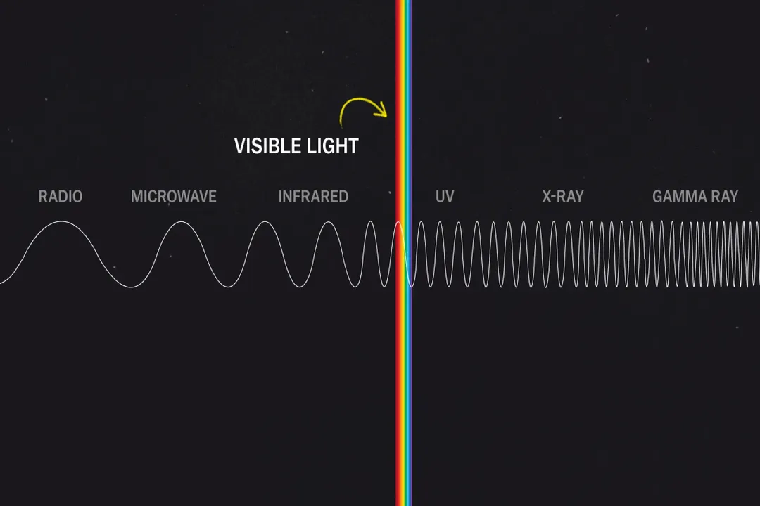
Hubble's cameras are designed to capture a much wider spectrum of electromagnetic radiation than our own eyes can process. [2] Human vision is limited to the narrow band of visible light, roughly between 400 and 700 nanometers in wavelength. [4] However, many crucial astronomical phenomena emit or reflect light in the ultraviolet (UV) or infrared (IR) parts of the spectrum. [2] To study these energetic processes—like the formation of hot, young stars or the cool dust surrounding them—Hubble must observe in these non-visible ranges. [2]
For example, an image might be taken where one exposure captures only UV light, another captures visible blue light, and a third captures infrared light. [2][4] None of these individual exposures reveal the full picture, nor do they inherently produce color that we can see directly. They are simply intensity maps—pictures showing how much light was detected at a specific, narrow wavelength. [2][4]
# Multiple Exposures
The technique relies on taking several separate images, each through a different colored filter placed in front of the camera’s charge-coupled device (CCD) sensor. [2][4] Think of this like taking three distinct black-and-white photographs of the same object, but each time you use a different piece of specialized glass to only let a specific color or wavelength pass through to the sensor. [2][4]
A key distinction must be made between images taken using filters that isolate known visible wavelengths and those using filters that isolate invisible wavelengths. [2][4] When the filters used correspond only to wavelengths the human eye can see, the resulting image is often labeled "true color". [2][5] Even then, the data from these visible-light exposures usually needs adjustment because the object is too dim for a simple, straight mapping. [4] The faintness of the signal necessitates increasing the contrast and brightness dramatically to reveal any detail at all. [2][4]
When the image relies on UV or IR data, the resulting image is fundamentally false-color because the light being measured cannot be seen by us in the first place. [2] The colorization process then becomes a deliberate act of representation rather than a simple photographic capture. [4]

# Data to Color
Once the astronomer has the three (or more) grayscale data sets from the different filters, the interpretation begins. [2][4] Image processors assign those grayscale maps to the red, green, and blue (RGB) channels of a standard color image. [2][4] This is the moment where the scientific data is translated into a visual experience. [2]
For a "true color" visible-light image, the process attempts to mimic what our eyes would see if the object were bright enough. If the filter used isolates light near the red end of the spectrum, that data map gets assigned to the red channel in the final image. The green-isolating data goes to the green channel, and the blue-isolating data goes to the blue channel. [2][4] However, even this is often tweaked. If the blue channel data is vastly brighter than the red channel data, simply mapping it directly would result in an image dominated by blue. Processors might scale the red data upward to make the faint red structures visible, resulting in an enhanced, but still fundamentally representative, color image. [4]
When scientists use infrared or ultraviolet filters, the color assignment is purely conventional, chosen to highlight specific physical processes or chemical compositions within the nebula or galaxy. [3][5]
# Element Assignment
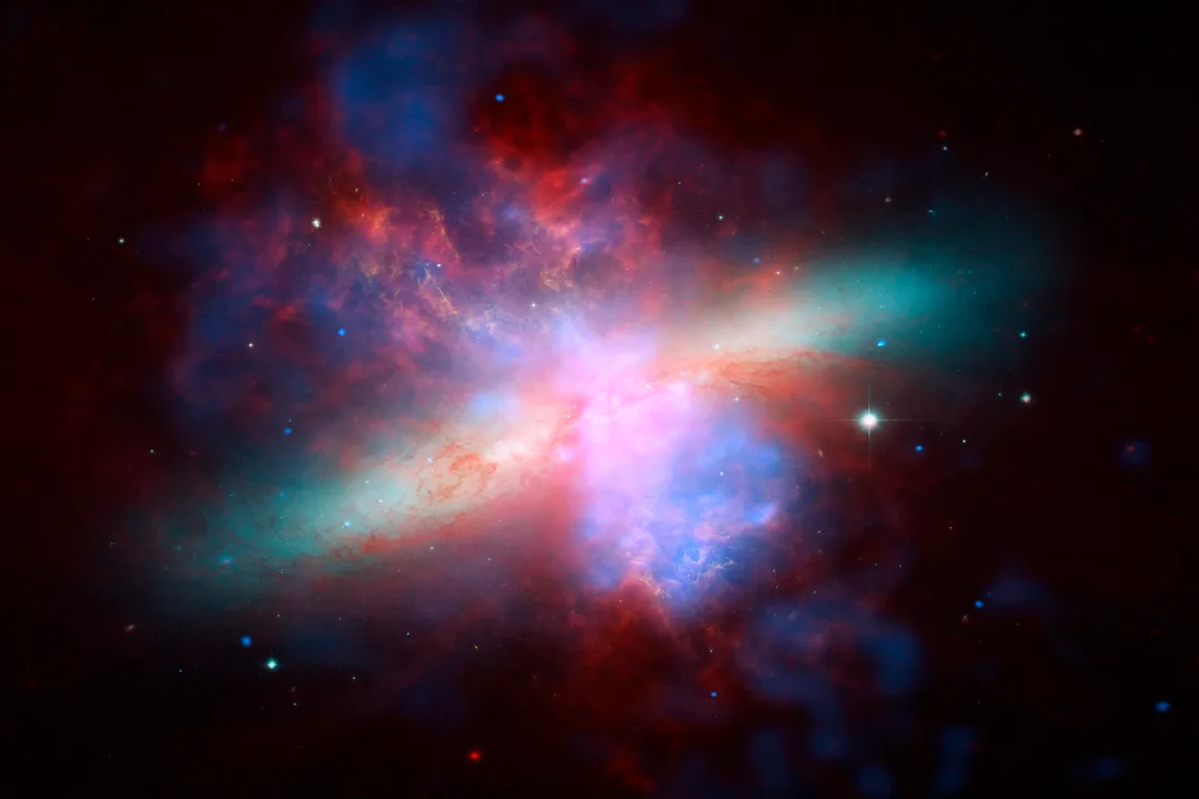
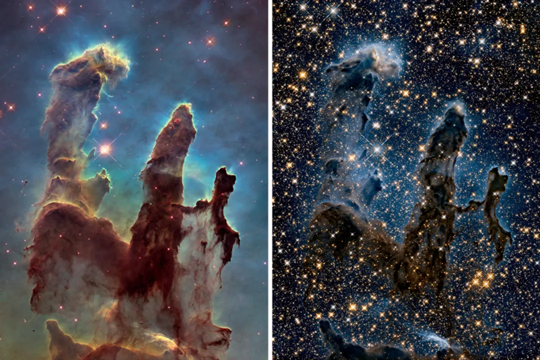
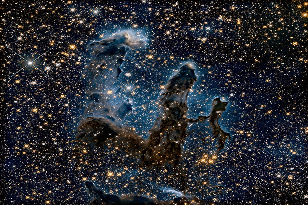
Perhaps the most famous example of this convention is the "Hubble Palette," often used for stunning images of emission nebulae, such as the Pillars of Creation in the Eagle Nebula. [2][3][5] This palette systematically maps specific chemical elements to the primary colors (RGB). [2]
For instance, one common configuration maps light emitted by ionized sulfur () to the red channel, light from ionized hydrogen () to the green channel, and light from ionized oxygen () to the blue channel. [2][3][5]
| Element/Wavelength | Associated Color Channel | Scientific Meaning |
|---|---|---|
| Ionized Sulfur () | Red | Indicates regions of relatively lower energy or specific elemental abundance [2][3] |
| Hydrogen () | Green | Maps the most abundant element, tracing star formation regions [2] |
| Ionized Oxygen () | Blue | Indicates regions of higher energy ionization [2][3] |
This assignment is not arbitrary guesswork; it is based on the known emission lines of these atoms. [2] By assigning a unique visible color to each element's signature wavelength, scientists can visually separate and study the distribution of different gases within the cloud, something that would be impossible if they were all blended together in a single-color image. [3] Viewing the resulting image allows researchers to immediately spot where oxygen is being excited by the hottest stars versus where the cooler, elemental sulfur is concentrated. [2]
# Scientific Value
The primary value of this careful color assignment is scientific insight, not artistic display. [2][3] The colors act as visual tags for chemical composition and energy levels. [3] If an image of a galaxy is processed to highlight the distribution of older, redder stars versus younger, bluer stars, the resulting color map tells astronomers about the galaxy's history of star birth and death. [2] Different colors can reveal shockwaves, magnetic field orientations, or the density gradients within interstellar dust. [2]
It is an accepted practice across astronomy that the visual presentation must serve the data. When researchers publish findings, they often include tables or detailed captions explaining the exact filter-to-color mapping used so that the scientific community can accurately interpret the visual evidence. [3]
One interesting consequence of this process, which viewers should keep in mind, is how the choice of imaging instrument dictates the potential for color representation. For example, an older Hubble instrument like the Wide Field Planetary Camera 2 (WFPC2) had specific, fixed filters that determined the available data set. A newer instrument, or one on a different telescope like the James Webb Space Telescope (JWST), will have entirely different filter sets, often focusing much more heavily on the infrared. [2] Therefore, a Hubble image of a star-forming region and a JWST image of the same region might use completely different color schemes because the underlying physics they are optimized to observe (e.g., visible-light emission versus infrared dust penetration) are different. [2] The color palette reflects the scientific question being asked, which is a direct function of the technology available at the time of observation. [2]
# Adjusting Brightness
Beyond the assignment of hue (the actual color, like red or blue), the adjustment of brightness and contrast is another layer of human intervention that moves the image away from being a direct recording. [4] Deep space objects are faint, and the raw data often contains vast amounts of empty, black space surrounding a relatively small, undetailed object. [2][4]
To make the image visually engaging and to reveal subtle details in the dimmer outer regions of a galaxy or nebula, image processors must stretch the brightness range. This means taking the darkest pixel value that registered some light and mapping it to a visible gray or black, and taking the brightest signal and mapping it to white or near-white, while distributing all the intermediate values across the visible spectrum. [4] This stretching process is crucial for revealing structure but inherently exaggerates the contrast between faint and bright areas compared to what the eye would perceive. [2]
A common pitfall for newcomers is assuming that the darkest parts of a nebula shown in a highly processed image are truly empty space. In reality, the processor has likely set a low threshold for visibility, meaning faint gas structures exist even in the darker, less saturated areas, simply too dim to be rendered with distinct color in the final output. [4]
This leads to an important point of comparison: a scientifically accurate image based purely on visible wavelengths and minimal processing would likely look unimpressive and dark, perhaps only marginally better than an amateur telescope photo, because the intensity of the light is the main variable, not the composition. [2]

# Sensory Translation
The entire process of generating a Hubble image can be analogized to translating a complex piece of music from its written notation into an auditory performance. [3] The musical score (the raw filter data) contains all the information—pitch, rhythm, duration—but it is not the sound itself. The conductor and musicians (the image processors) interpret that score. They decide the exact tempo (the brightness scaling), the precise timbre (the color palette selection based on scientific goals), and the dynamic range (contrast adjustments) to present the composition to an audience. [3] Just as different orchestras can perform the same Bach fugue with vastly different emotional impacts depending on their interpretation of the dynamics, different teams can process the same Hubble data to emphasize different scientific features. [2][3] Both are "real" performances derived from the original score, but neither is an exact, passive replication of the score itself. [2] Understanding this translator's role is key to appreciating the final artwork.
If you are looking at an image that emphasizes hydrogen and oxygen separation via the palette, you are reading the "chemical structure" interpretation of the data. If you are looking at an image where the filters were all restricted to the visible-light range and then scaled slightly, you are reading the "apparent brightness" interpretation. The difference lies in the initial choice of which scientific questions the filter set was designed to answer. [2]
# Next Generation
This tradition of translating light data continues with newer instruments, such as the James Webb Space Telescope (JWST). [6] JWST primarily observes in the infrared, meaning its raw data is even further removed from human visual perception than Hubble’s typical inputs. [6] Consequently, JWST images are almost always false-color, where scientists use the infrared wavelengths captured to represent visible colors or use specific infrared bands to stand in for the visible elements Hubble once targeted. [6] The key difference is that JWST excels at seeing through dust clouds that block visible light, revealing infant stars previously hidden. [6] The resulting imagery, while spectacular, demands the same level of scientific literacy from the viewer to understand that the colors serve as essential data labels rather than direct snapshots of reality. [2][6] The reality of space, as seen through our telescopes, is a layered construction of data, filters, and interpretation, all aimed at expanding what humanity can see and understand about the universe. [4][5]
#Videos
How are Hubble Space Telescope images 'colorized' and processed?
Related Questions
#Citations
TIL all Hubble Telescope images are all false color – meaning they ...
The Truth About Hubble, JWST, and False Color | NASA Blueshift
Are the Colors Real? - Illuminated Universe
Are the Colors in Astronomical Images 'Real'? - Scientific American
Are Hubble Telescope Images in true color? - Physics Stack Exchange
Are the colors in Hubble images real? - Facebook
How are Hubble Space Telescope images 'colorized' and processed?
Why are pictures from the Hubble telescope so colorful? - Quora
How scientists colorize photos of space - Vox