How to use the H-R diagram?
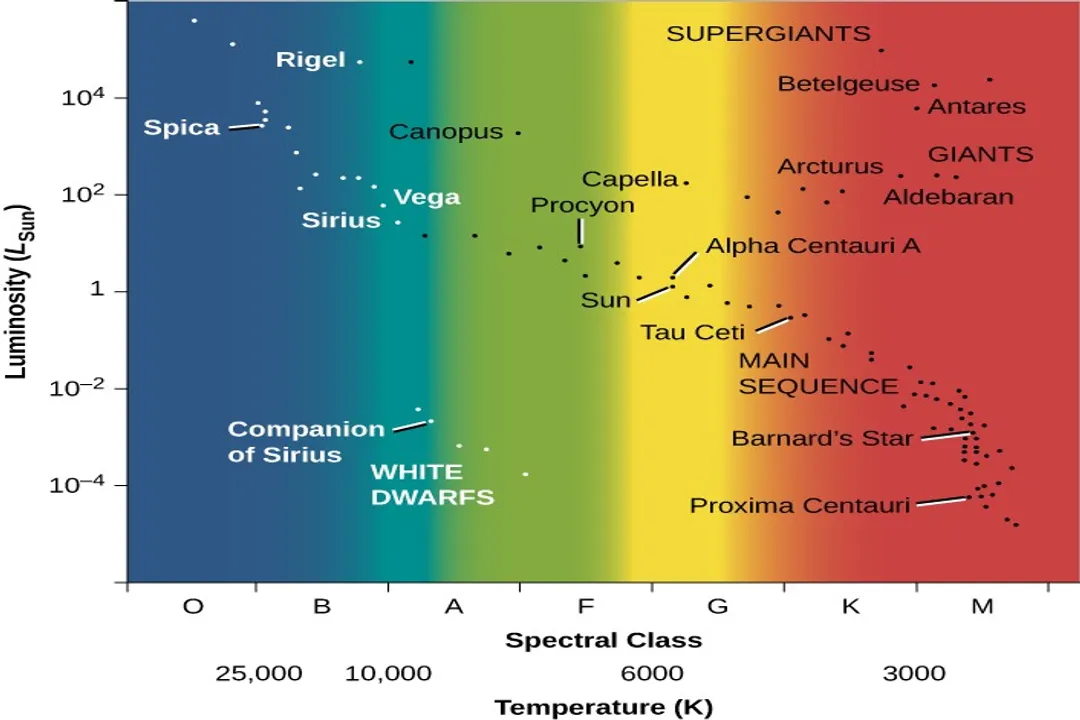
The Hertzsprung-Russell diagram, often abbreviated as the H-R diagram, stands as one of the most fundamental tools in the study of stellar astronomy, acting as a Rosetta Stone for understanding the lives and relationships between stars. [2][9] At its simplest, the diagram is a scatter plot that organizes stars based on two key intrinsic properties: their luminosity (or absolute magnitude) and their surface temperature (or spectral type). [2][3][6][10] By plotting these values, astronomers transform a seemingly random collection of celestial lights into a structured map revealing stellar families, evolutionary stages, and age sequences. [5][8]
# Diagram Axes
Understanding how to use the H-R diagram begins with mastering its axes, as they are not always intuitive. [7][10] The vertical axis, representing the star's luminosity, is typically plotted on a logarithmic scale, with the brightest stars found at the top and the dimmest at the bottom. [3][6] Luminosity is the total energy a star radiates per second, which astronomers often measure using absolute magnitude, where smaller (or more negative) numbers indicate greater brightness. [2][10]
The horizontal axis represents surface temperature or, more commonly, the spectral classification. [3][7] Here lies the first point that often trips up newcomers: the temperature scale runs backward compared to typical graphs. [10] The hottest stars, classified as O or B types, are found on the far left side of the diagram, possessing temperatures potentially exceeding $30,000$ Kelvin. [2][7] As you move to the right, the stars become progressively cooler, classified as A, F, G (like our Sun), K, and finally M types, with surface temperatures dipping below $3,500$ Kelvin. [2][7] This arrangement preserves the historical sequence in which the spectral types were first categorized, rather than ordering them strictly by temperature. [10]
A helpful way to visualize this historical quirk is to remember that "O" used to mean "hottest known" when Ejnar Hertzsprung and Henry Norris Russell first plotted their data, establishing the layout that persists today. [9][10] If the x-axis were plotted purely by temperature ascending from left to right, the entire diagram would flip horizontally, but astronomical convention keeps the spectral type ordering dominant. [3]
# Stellar Groupings
When a large population of stars—say, all the stars in the Milky Way or those within a specific star cluster—are plotted, they do not scatter randomly across the diagram. Instead, they cluster into distinct, well-defined areas, each corresponding to a particular phase of stellar life or a specific type of star. [2][3][5] Navigating these regions is the primary function of using the H-R diagram.
# Main Sequence
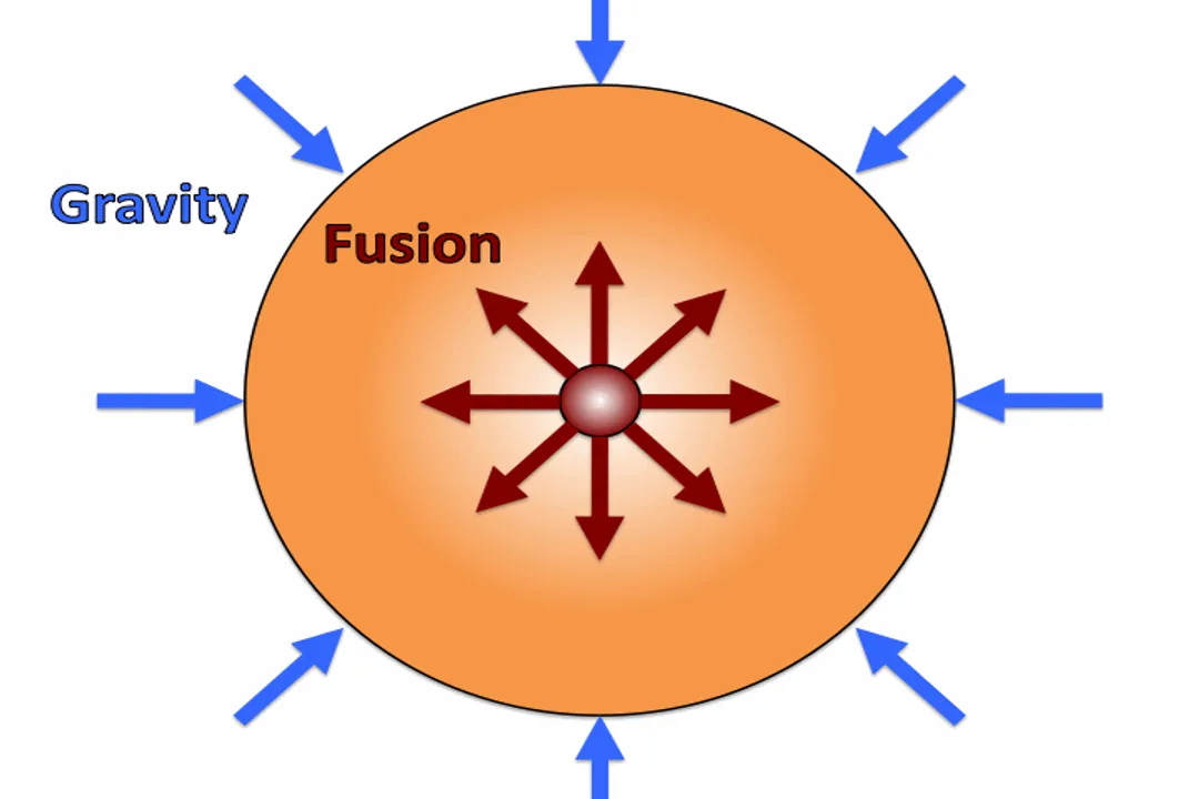
The most prominent feature on the diagram is the Main Sequence. [2][6] This diagonal band runs from the upper-left (hot, bright) to the lower-right (cool, dim). [3] Approximately $90$ percent of all stars, including our Sun, reside on this sequence, as it represents the phase where a star is actively fusing hydrogen into helium in its core—the longest and most stable period of its existence. [2][6][9]
Mass is the critical determinant for a star's position on the Main Sequence. [5] More massive stars are much hotter and more luminous, placing them high up and to the left. [2] Less massive stars are cooler and dimmer, occupying the lower-right portion. [2][3] For example, a star like our Sun is a G-type star near the middle of the sequence, while a massive blue giant sits near the top-left corner. [2][6]
# Giant and Supergiant Regions
Above the Main Sequence, occupying the upper-right portion of the diagram, are the Giants and Supergiants. [2][5] These stars are characterized by immense luminosity but relatively low surface temperatures, meaning they must be physically enormous in size to radiate so much energy. [3][6]
- Giants: These stars have exhausted the hydrogen fuel in their cores and have begun fusing hydrogen in a shell around the core, causing their outer layers to expand dramatically. [5] They appear reddish or orange because their surface temperature is lower than that of a Main Sequence star of similar luminosity. [2]
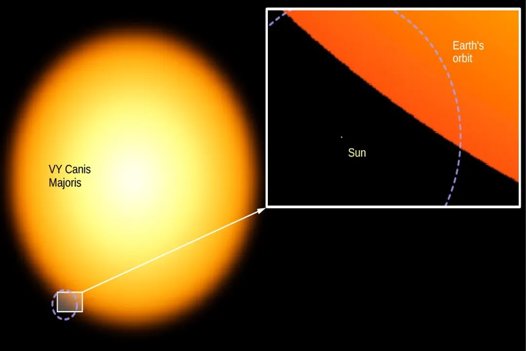
- Supergiants: These are the most massive stars, located at the very top of the diagram. [2] They are extraordinarily luminous, often millions of times brighter than the Sun, yet their outermost layers are also cooler than Main Sequence stars of similar mass, placing them far to the right of the Main Sequence's upper end. [5]
# White Dwarfs
Contrasting sharply with the luminous giants, the White Dwarf stars occupy the lower-left region of the diagram. [2][3] These stars are incredibly hot—sometimes hotter than some Main Sequence stars—but they are extremely dim because they have shrunk to roughly the size of the Earth. [6][10] They represent the end stage for low- to intermediate-mass stars, where the remaining, inert helium core has collapsed. [5] Their low luminosity, despite high temperature, is the key identifier in this region. [2]

# Reading Stellar Evolution
One of the most powerful applications of the H-R diagram is tracking the evolution of a star over cosmic timescales. [5][8] Because the diagram fixes a star based on its current physical state (luminosity and temperature), tracing a path across the diagram shows how those properties change as the star ages. [5][8]
# Pre-Main Sequence Life
Before a star officially ignites hydrogen fusion and joins the Main Sequence, it exists as a protostar contracting under gravity. On the H-R diagram, this phase is represented by a relatively steep, rapid descent from the top-right corner, known as the Hayashi track, moving towards the Main Sequence. [5] The star gets hotter (moving left) while contracting (becoming less luminous, moving down) until it settles onto the diagonal band. [5]
# Post-Main Sequence Change
Once a star exhausts its core hydrogen, its evolutionary path diverges dramatically depending on its initial mass. [5]
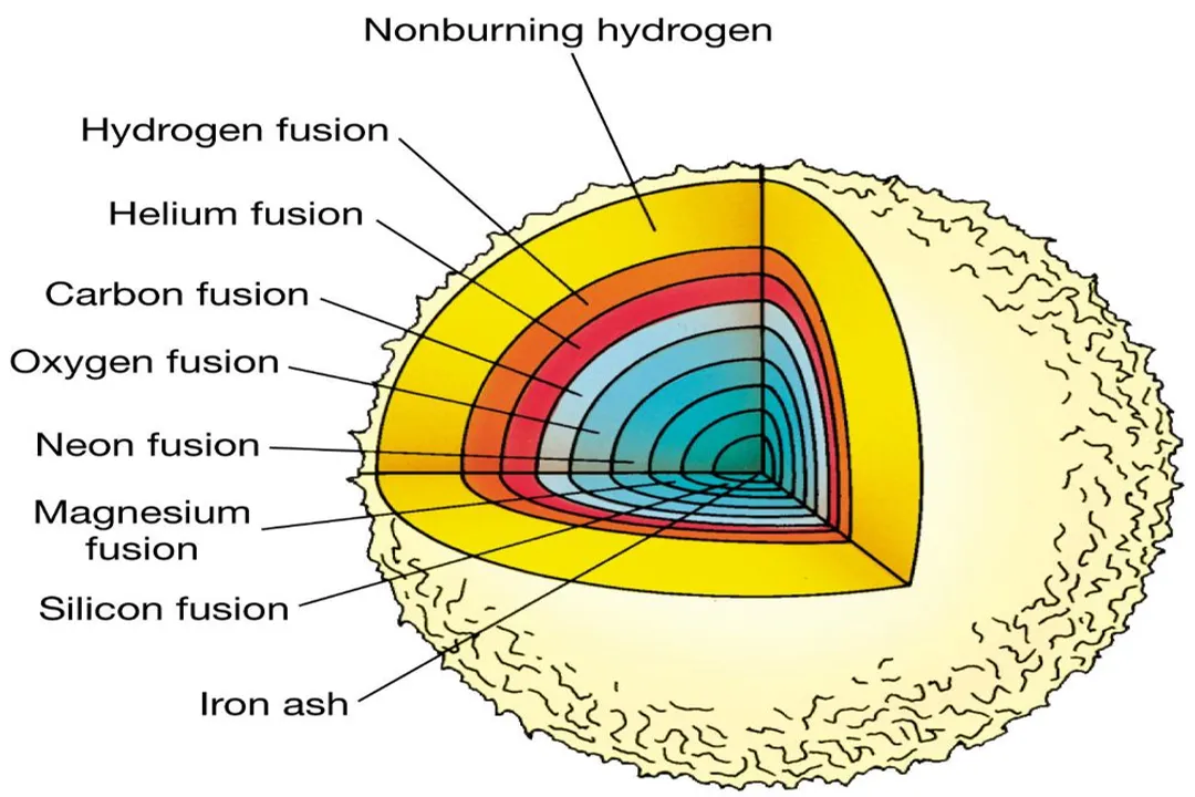
- Sun-like Stars (Low to Intermediate Mass): When a star like the Sun leaves the Main Sequence, it rapidly expands and cools, causing its position on the H-R diagram to swing sharply up and to the right into the Red Giant branch. [5][8] After further core fusion stages (like helium burning), the star may shrink slightly and become hotter (moving left), eventually shedding its outer layers to form a planetary nebula, leaving behind a cooling White Dwarf. [5][8] The white dwarf then traces a path almost straight down the diagram as it cools over billions of years. [5]
- Massive Stars: Stars significantly more massive than the Sun follow a path that moves almost horizontally across the diagram after leaving the Main Sequence, becoming Red Supergiants. [5] Their path back toward the left side of the diagram is often much faster than their time spent on the Main Sequence. [5][8] Their final stages lead to core collapse and supernova, after which any remaining core becomes a neutron star or a black hole, which are generally too faint or too small to appear clearly on standard H-R plots of living stars. [5]
It is fascinating to consider that while the Main Sequence represents the star's youth and middle age, the entire cluster of Giants and Supergiants often represents just a few percent of its total lifespan. [5] A star might spend billions of years on the Main Sequence but only a few million years traversing the Supergiant region. [2] This disparity in time means that, statistically, there will always be far fewer observed stars in the giant/supergiant areas than on the Main Sequence for any given population, which is why the Main Sequence appears so densely populated on the diagram. [6]
# Using the Diagram for Analysis
The H-R diagram is not just a descriptive tool; it is an analytical instrument used to derive quantitative data about stellar populations, particularly when observing star clusters. [8]
# Determining Age and Distance
When observing an open cluster or globular cluster, plotting its member stars yields a distinct pattern where the Main Sequence appears relatively sharp. [8] The point at which the stars begin to "peel off" the Main Sequence—the Main Sequence Turnoff Point—is an extremely sensitive indicator of the cluster's age. [8]
If a cluster's highest-mass, hottest stars are still burning hydrogen and sitting on the Main Sequence, the cluster is young. If only the lower-mass stars remain, the cluster is old, as the massive stars have already evolved into giants or died. [2][8] Since the evolutionary track for stars of a known mass is well-established, finding the turnoff point allows astronomers to calculate the cluster’s age directly. [8]
Furthermore, the diagram helps correct for distance. Since the vertical axis uses absolute magnitude (true brightness), comparing the plotted absolute magnitude with the apparent magnitude (how bright the star looks from Earth) allows for a precise calculation of the cluster's distance using the distance modulus. [6]
# Inferring Mass and Radius
Once a star's location on the Main Sequence is established, its mass can be inferred with high accuracy, often within about $10%$. [5] This relationship is fundamental: mass dictates luminosity and lifetime. [2]
The radius of a star can also be determined using the relationship derived from the Stefan-Boltzmann Law, which links Luminosity (), Radius (), and Temperature (): . [2] By rearranging this, we can write:
On the H-R diagram, lines of constant radius are represented by curves sloping from the upper-right to the lower-left, cutting across the Giant and Main Sequence regions. [2] Stars lying on the same radius line will have a proportional relationship between their temperature and luminosity. For instance, a star in the Supergiant region has a very large radius, while a White Dwarf has a radius much smaller than the Sun's, even if its temperature is similar to a hotter Main Sequence star. [6]
A practical exercise for mastering the H-R diagram involves overlaying the Main Sequence lines from a theoretical stellar model onto an observed cluster plot. You will notice that for any given cluster age, the Main Sequence band isn't a perfect line but has some visible thickness. This scatter, particularly pronounced for the cooler, lower-mass end of the sequence, often reflects the difficulty in precisely measuring the absolute magnitudes of faint, distant stars, or slight variations in metallicity between the cluster members, which subtly shifts their position away from the idealized single-mass-track prediction. [8]

# Spectral Type and Color
While temperature is one axis, the spectral type (O, B, A, F, G, K, M) is intrinsically linked to the star's color and the absorption lines visible in its spectrum. [7] The hottest O stars emit most of their light in the blue and ultraviolet, making them appear blue. [2][7] As you move down the sequence to G stars like the Sun, the peak emission shifts toward the yellow-green, giving them a yellowish appearance, and finally, the coolest M stars peak in the red, appearing deep red. [2][7] Using the spectral classification on the x-axis is often more reliable than using a direct temperature reading because the spectral classification is based on observed absorption lines, which are robust indicators of surface conditions. [7]
# Interpreting a Single Star's Data
When you isolate a single star and locate it on the H-R diagram, its position immediately constrains what you know about it, even if you only measured one other parameter:
- If you know its Luminosity (): Its location defines its Temperature () and Spectral Type via the x-axis scale, and its Radius () via the radius lines.
- If you know its Temperature (): Its location defines its Luminosity (), and subsequently, its spectral type and its approximate Mass () if it falls on the Main Sequence.
If a star plots far away from the Main Sequence, the immediate conclusion is that it is not currently fusing core hydrogen; it is either a very young pre-main sequence object, or it is an evolved post-main sequence star (Giant, Supergiant, or White Dwarf). [5] For example, finding a star with a temperature of $4,000$ K and a luminosity $100$ times that of the Sun immediately places it in the Giant branch, indicating it has lived through its main sequence phase. [6] This ability to classify stellar status at a glance is why the diagram is indispensable. [10]
This graphical representation, first conceived through painstaking observations by Ejnar Hertzsprung and Henry Norris Russell around $1910$, continues to serve as the primary organizational tool for understanding the life cycle and physical characteristics of stars across the cosmos. [9][10]
#Videos
HR Diagram Explained - Star Color, Temperature and Luminosity
Related Questions
#Citations
HR Diagram Explained - Star Color, Temperature and Luminosity
Hertzsprung-Russell Diagram | COSMOS
The Hertzsprung-Russell Diagram - NAAP - UNL Astronomy
Introduction to the HR Diagram - Chandra X-ray Observatory
The H–R Diagram | Astronomy - Lumen Learning
Pre-lab 9: Stars and the HR Diagram - MTSU Physics
Tracking the evolution of a star on the HR Digram. I need some help
The Hertzsprung-Russell diagram - CESAR - ESA Cosmos
Hertzsprung–Russell diagram - Wikipedia