What is the H-R diagram in simple terms?
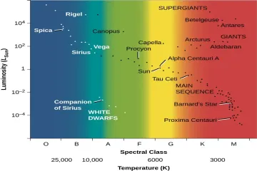
The Hertzsprung-Russell diagram, often shortened to the H-R diagram, is one of the most essential tools in an astronomer’s toolkit. Think of it not as a picture of the sky, but as a special type of scatter plot or graph that maps out the fundamental properties of stars, revealing their current stage of life and helping scientists understand how they evolve. [1][2][7] It plots stars based on two key characteristics: how intrinsically bright they are and how hot they are. [2][5]
# Stellar Map
The concept was developed independently by Ejnar Hertzsprung, a Danish chemist and astronomer, and Henry Norris Russell, an American astronomer, around the early 1900s. [1][3] When they plotted the stars in their respective studies, they noticed that the stars didn't scatter randomly across the graph. Instead, they clustered into distinct, recognizable groups. [3] This non-random distribution is what gives the diagram its power; it shows that stellar properties are deeply interconnected. [7] For anyone studying stellar evolution, this diagram serves as a benchmark, allowing astronomers to place any observed star into context relative to billions of others. [4]
# The Two Scales
Understanding the H-R diagram means understanding its axes, which can be slightly confusing at first glance because of how astronomers measure brightness and temperature. [8]
# Vertical Axis
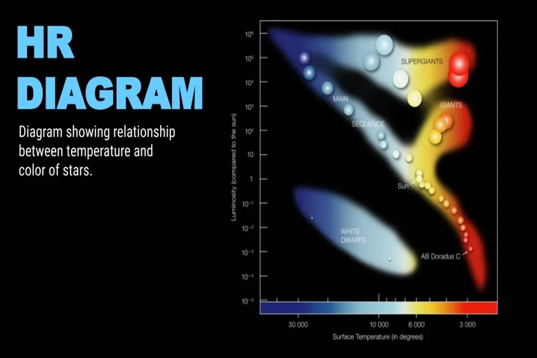
The vertical line represents the star's luminosity, or its true energy output. [7] This is not the same as apparent brightness—how bright a star looks from Earth. Luminosity is the star’s actual power output, regardless of distance. [2] On the diagram, this axis is usually plotted using absolute magnitude, a measure of intrinsic brightness. [3][7] Here is where it gets counterintuitive: the brightest stars are at the top, corresponding to lower (or negative) absolute magnitude numbers, while the dimmest stars are near the bottom, corresponding to higher positive magnitude numbers. [2][8] Imagine it like a ranking system where being number 1 is the best (brightest), and the numbers increase as you get dimmer. [10]
# Horizontal Axis
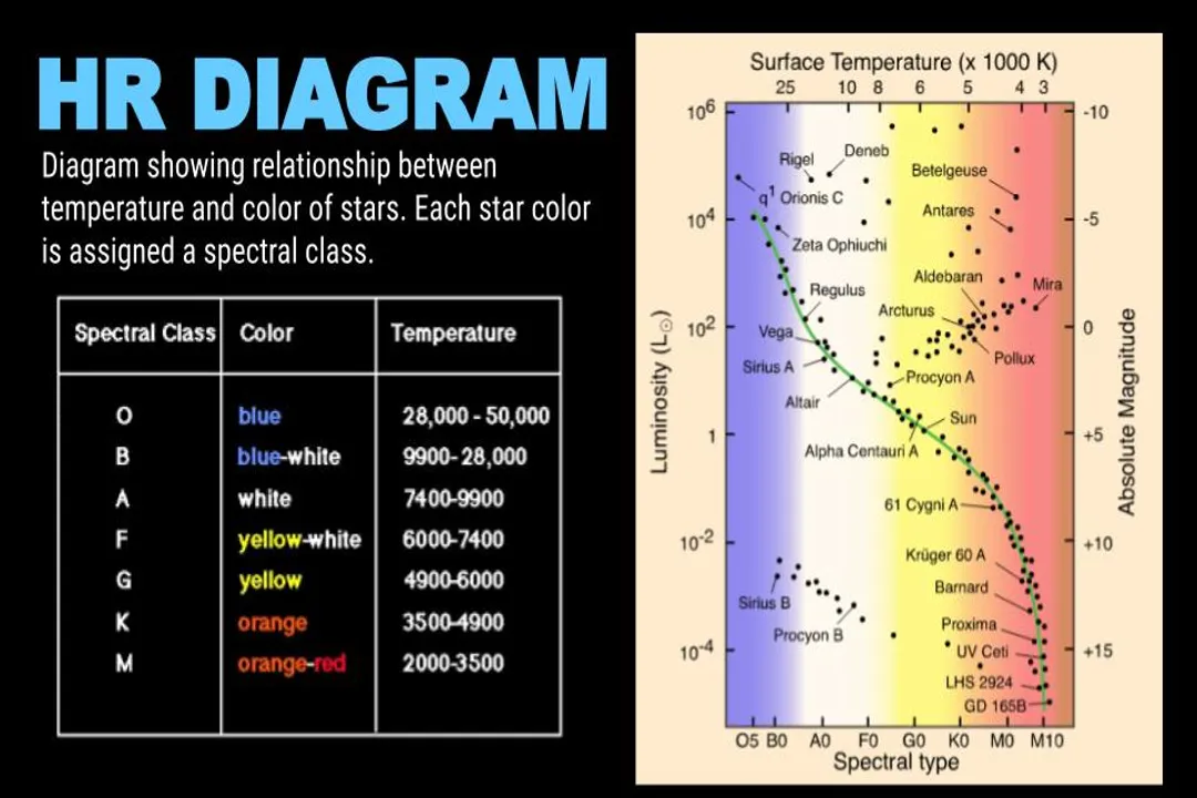
The horizontal line measures the surface temperature of the star, which is directly related to its spectral class and color. [3][7] However, unlike the vertical axis, this one runs backward. The hottest stars are plotted on the left side of the diagram, while the coolest stars are on the right side. [2][7] Temperatures for these hot stars can exceed 30,000 Kelvin, while the coolest stars hover around 3,000 Kelvin. [8] This arrangement means that a star’s color also maps directly across this axis: blue-white stars are on the left, and red stars are on the right. [5]
To truly grasp this, consider the implication of combining the axes. A star that is extremely hot (far left) but happens to be very dim (low on the vertical scale) must be extremely small—a white dwarf, for example. [2] Conversely, a star that is relatively cool (far right) but incredibly luminous (high on the vertical scale) must be gigantic—a red giant. [2]
# Main Zones
When stars are plotted, they fall into several predictable groups or regions, which reflect their current state of development. [1][7]
# Main Sequence
The most populated area, containing about 90% of all stars observed, is the Main Sequence. [1][7][10] This diagonal band runs from the upper-left (hot, luminous stars) down to the lower-right (cool, dim stars). [7] Stars on the Main Sequence are fusing hydrogen into helium in their cores—the primary, stable phase of stellar life. [2] Our own Sun, a G2V type star, sits right in the middle of this sequence. [8] The position a star occupies on this line is almost entirely determined by its initial mass. [7][10] More massive stars are hotter, brighter, and sit in the upper-left; less massive stars are cooler, dimmer, and sit in the lower-right. [1][2]
One way to view the Main Sequence is as the stellar equivalent of a "Goldilocks Zone" for energy production. A star is in hydrostatic equilibrium here, meaning the outward pressure from nuclear fusion perfectly balances the inward crush of gravity. [7] Most stars spend the vast majority of their existence, often billions of years, locked in this stable setting. [4]
# Giant Stars
Above the Main Sequence, you find the Giants and Supergiants. [3][7] These stars are typically aging stars that have exhausted the hydrogen fuel in their cores and have begun fusing heavier elements or expanding significantly. [1][7] Because they are so large, even if their surface temperature is relatively cool (placing them on the right side of the diagram), their sheer size makes them extremely luminous, pushing them high up on the vertical axis. [2] Supergiants are the largest and most luminous stars in the entire diagram. [1]
# White Dwarfs
In contrast to the giants, the bottom-left area of the diagram is occupied by White Dwarfs. [3] These are the remnants of low-to-medium mass stars, like our Sun, after they have shed their outer layers. [7] They are small, incredibly dense, and have very hot surfaces (placing them left) but are intrinsically very dim because of their tiny size (placing them low on the luminosity scale). [2][10]
# Reading Stellar Ages
The diagram is a snapshot, but it is most powerful when used to track evolutionary pathways. [7] If you observe a cluster of stars that all formed at the same time (an open cluster, for instance), they will all start on the Main Sequence. As they age, the most massive ones exhaust their fuel first and peel off the sequence, moving upward and rightward toward the giant branch. [7] Astronomers use this "turnoff point" on the Main Sequence to accurately age the cluster. [4]
It is fascinating to trace the path of a star like the Sun. It begins life on the Main Sequence, perhaps slightly bluer than where it sits now. Once its core hydrogen is gone, it will swell into a subgiant, then a Red Giant, and finally shed its outer layers to become a faint, hot White Dwarf, settling into the lower-left corner to cool for eons. [1][7] This entire evolution, from Main Sequence to remnant, dictates where it will plot on the H-R diagram over cosmic time. [10]
# Color Versus Magnitude Nuances
When you are looking at an H-R diagram, remember that plotting absolute magnitude directly against surface temperature mixes two fundamentally different physical concepts. [3] Magnitude is tied to surface area and temperature (), while temperature is a measure of the energy state of the atoms on the surface. [2]
When trying to estimate the properties of a star you see in the night sky without knowing its distance, you are stuck using apparent brightness, not luminosity. This creates a practical hurdle. If you only have the spectral type (temperature) and apparent brightness, you must assume the star is on the Main Sequence to get a sensible answer for its true brightness and distance. [8] If your assumption is wrong—if the star is secretly a giant or a dwarf—your resulting distance calculation will be wildly incorrect. For the everyday observer, this means that unless you are studying a known cluster, the H-R diagram is a tool of inference, relying heavily on established stellar models derived from the stars already plotted on it. [5]
# A Look at the Dimensions
To better appreciate the different classes, it helps to see how the scale of size changes across the diagram. We can add a conceptual "Radius" indicator overlay onto the standard H-R diagram structure.
| Spectral Type / Class | Color Approximation | Relative Temperature (K) | Location on H-R Diagram | Typical Size Comparison |
|---|---|---|---|---|
| O | Blue | > 30,000 | Upper-Left (Main Seq. & Giants) | Very Large to Massive |
| G (Sun's Type) | Yellow-White | ~5,000 - 6,000 | Middle (Main Sequence) | Medium |
| M | Red | < 4,000 | Lower-Right (Main Seq. & Giants) | Small (Dwarfs) to Huge (Giants) |
| (Remnants) | White/Blue-White | High | Lower-Left | Earth-sized |
This comparison highlights why the diagram is so useful. A red star (Type M) on the Main Sequence is a small, cool dwarf, but a red star in the Giant region has a radius hundreds of times greater than the Sun. [2][7] It is the combination of temperature (horizontal) and luminosity (vertical) that specifies the actual physical size. [3]
# Modern Applications
While the original purpose was classification, modern astrophysics uses the H-R diagram to test models of stellar physics. [7] By taking data from large surveys, astronomers can map out the structure of the Milky Way based on the populations of stars they find in different regions of the diagram. [4] Furthermore, astronomers can use the diagram to understand the relationship between mass and evolution for binary star systems or to study stellar populations in distant galaxies by observing their integrated light. [1] It remains the foundational map for connecting a star's observable properties (light and color) to its physical properties (mass, age, and fate). [5][10]
#Videos
HR Diagram Explained - Star Color, Temperature and Luminosity
Related Questions
#Citations
Hertzsprung–Russell diagram - Wikipedia
Hertzsprung-Russell Diagram | COSMOS
Hertzsprung-Russell diagram | Definition & Facts - Britannica
HR Diagram Explained - Star Color, Temperature and Luminosity
What is the Hertzsprung–Russell diagram? - Quora
The HR Diagram - NASA ADS
The H–R Diagram | Astronomy - Lumen Learning
AstroPages | HR Diagram | Western Washington University
HR Diagram Explained - Star Color, Temperature and Luminosity
Pre-lab 9: Stars and the HR Diagram - MTSU Physics